Marathon Health
Marathon provides employer-sponsored healthcare to businesses nationwide. Focusing on patient-provider moments and preventive care, they are driven to transform the healthcare industry. By delivering a better patient experience they aim to improve the health and quality of life of every employee.
Role
UI/UX Designer
Team
Mobile App & Web Portal
Year
2021 / 2023

With their patient-facing mobile app and web portal, employees can access their health records, schedule appointments, message their care team, and refill prescriptions.
Part of what makes Marathon unique is its Incentives program, which offers employer groups access to wellness-based challenges in exchange for rate discounts and other prizes.


Incentives
USER STORY
'As an employee, I want to participate and track my progress in Incentives, so that I can work towards receiving a discount on my benefit rates, while simultaneously improving my health.'
REQUIREMENTS
For V1, we prioritized 4 incentive activities with a focus on preventive care. After patients complete each activity they're rewarded with points. The My Status card allows patients to easily track their progress and time remaining in the program.
SOLUTION


Health Risk Assessment
An interactive questionnaire that collects medical and lifestyle information.

At 11 sections, the questionnaire is fairly long. On a mobile device, the user could face various types of interruptions and distractions, leading to unsuccessful completion of the task.
Including a progress bar helps the user see what they've completed. Having a secondary CTA allows the user to finish later, should they need to pause their progress. Labeling the primary CTA with 'Save' communicates to the user the data they've entered will not be lost.
PROBLEM
SOLUTION
Using gamification visuals, engage and excite the user to complete the priority activities.
Home Redesign
PROBLEM


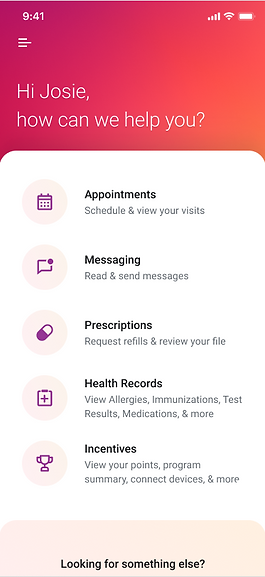
As new features were added, the list inside the sheet continued to get longer. With no visual hierarchy, users didn't know what to focus on first and had trouble locating the feature they needed. In addition, some features and sections were hidden in the hamburger menu.
-
Using metrics and user surveys, I prioritized the most used features by placing them in the hero section, which created visual hierarchy and increased their visibility.
-
By replacing the hamburger menu with a bottom tab bar, features are less hidden and the user can better see where they currently are in the app. The intuitive icons allow for quick navigation to other most-used sections.
-
For Incentives, the user can immediately see their status and point progress while still on the Home screen, without having to navigate to that section.
SOLUTION
Appointment Scheduling

Before

After
PROBLEM
The self-scheduling feature pulls backend appointment data from Athena, which includes provider profiles, multiple networks, and locations. The backend logic for determining the provider and network defaults would not always pull available appointment slots, and instead would show no appointment availability. In these use cases, the user would need to adjust their network to expand their search, however, users did not understand the location chip was accessible, and in most cases would abandon the task.
SOLUTION
Splitting the filters into two separate chips allows the user immediate visibility of which network and provider preferences they're searching under.
Adding an intuitive filter icon next to the chips informs the user they have the ability to adjust their search criteria. Each chip gives a visual cue that the user can tap and adjust the settings to revise their search results.
Introducing separate filter chips for network and providers allows us to explore additional filters and continue offering the user more ways to quickly and easily find the appointment they need.

Relying on Athena to pull appointments would sometimes cause increased load times. Originally an animated loader was used, but I felt it became visually tiresome. We chose to replace the loader with skeletons and use the animated loader more intentionally in specific situations.

In a use case where a user searches a week and no appointments are available, the Provider chip is disabled which offers a visual queue to adjust the network or try searching a different week.

An infinity loader is used when searching the following week or when the user interacts with the calendar component.

The network filter allows the user to select only 1 network at a time. If the filters are cleared the primary CTA becomes disabled. Tapping the Apply Filters CTA closes the window while sending a call to the backend. The results are shown on the Choose a Time screen.

The provider filter uses similar logic, but also allows the user to select multiple providers. The use case shown here is when the search logic defaults to the last provider seen.
Web Portal Appointment Scheduling Redesign
PROBLEM
Through feedback from usability studies, surveys, and data received from the Member Relations Team, we discovered that users were often frustrated and confused when trying to schedule an appointment.
We learned the category cards were usually where the flow was abandoned. The cards separated appointment reasons into different categories but did not allow visibility into what was inside. Only after the user selects a category card does a menu appear allowing them to select their visit reason.
Users also reported feeling overwhelmed by the number of choices and information, which slowed down their progress.
The Choose a Time screen was also a painpoint. We discovered users tried to interact with the month-view calendar first, but its functionality was limited to view only. On the week-view calendar, users were confused about how to select from the available appointments, which used limited details and no visibility of provider or time information. In order to proceed, a modal would show appointment availability but if the user decides to select a different date they had to close the modal and start over.
Again, users reported feeling overwhelmed by unnecessary information which distracted them from completing their task.


Desktop Breakpoint

With 3 dropdown menus the user immediately understands they can quickly select each in order to view availability. The upcoming appointment section allows the user to see what has been previously booked before they schedule a new visit.

We gave each user a unique avatar so they can quickly identify upcoming appointments for spouses and dependents.

The success screen gives the user options to add to their calendar, find directions, cancel or reschedule. The visit notes section provides important details regarding their visit.

With 3 dropdown menus the user immediately understands they can quickly select each in order to view availability. The upcoming appointment section allows the user to see what has been previously booked before they schedule a new visit.
SOLUTION
With 3 dropdown menus, the user immediately understands they can quickly select each in order to view availability. The upcoming appointment section allows the user to see what has been previously booked before they schedule a new visit.
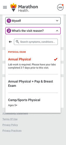
Adding a field for hint text provided visibility to describe appointment details, including age restrictions and any other important information regarding their visit.
The success screen gives the user options to add to their calendar, find directions, cancel or reschedule. The visit notes section provides important details regarding their visit.
We gave each user a unique avatar so they can quickly identify upcoming appointments for spouses and dependents.
The user is auto-prompted to the next dropdown menu as they make their selections.
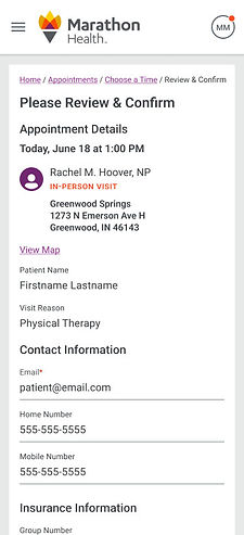
Including the map on the review and confirm screen ensures the user knows where their in-person visit will be held. A secondary CTA allows the user to go back and select a different appointment slot.
Allowing the user to search by typing in the visit reason gives them greater access to browse. Predictive text helps with typing errors. Related keywords help narrow results in case the user does not know the exact visit reason title.
The Choose a Time screen allows the user to filter availability by what is important to them. Some users want a specific provider while others want a specific time of day or clinic. For in-person visits the map provides immediate location visibility. The week-view calendar functions as the user selects each day.


